


Clusters should not be sorted from Major to Supporting and then taught in that order. To do so would strip the coherence of the mathematical ideas and miss the opportunity to enhance the major work of the grade with the supporting clusters.
- Assessment Limits :
Numbers in items must be rational numbers.
- Calculator :
Neutral
- Context :
Allowable
- Test Item #: Sample Item 1
- Question:
A scatter plot is shown for bottled water sales and temperature.
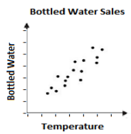
Select all statements that correctly interpret the graph.
- Difficulty: N/A
- Type: MS: Multiselect
- Test Item #: Sample Item 2
- Question:
A scatter plot is shown.
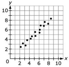
Which statement is true for the scatter plot?
- Difficulty: N/A
- Type: MC: Multiple Choice
Related Courses
Related Access Points
Related Resources
3D Modeling
Formative Assessments
Lesson Plans
Original Student Tutorials
Perspectives Video: Expert
Perspectives Video: Professional/Enthusiasts
Problem-Solving Tasks
Student Center Activity
Teaching Idea
Tutorial
Video/Audio/Animations
Virtual Manipulatives
STEM Lessons - Model Eliciting Activity
Students will apply skills (making a scatter plot, finding Line of Best Fit, finding an equation and predicting the y-value of a point on the line given its x-coordinate) to a fuel efficiency problem and then consider other factors such as color, style, and horsepower when designing a new coupe vehicle.
Model Eliciting Activities, MEAs, are open-ended, interdisciplinary problem-solving activities that are meant to reveal students’ thinking about the concepts embedded in realistic situations. Click here to learn more about MEAs and how they can transform your classroom.
MFAS Formative Assessments
Students are asked to construct a scatterplot corresponding to a given set of data.
Students are given a scatterplot in a real-world context and asked to describe the association between the variables.
Students are given a scatterplot in a real-world context and asked to describe the association between the variables.
Students are given a scatterplot in a real-world context and asked to describe the association between the variables.
Students are given a scatter plot in a real-world context and asked to describe the association between the variables.
Original Student Tutorials Science - Grades K-8
Continue an exploration of kinematics to describe linear motion by focusing on position-time measurements from the motion trial in part 1. In this interactive tutorial, you'll identify position measurements from the spark tape, analyze a scatterplot of the position-time data, calculate and interpret slope on the position-time graph, and make inferences about the dune buggy’s average speed
Describe the average velocity of a dune buggy using kinematics in this interactive tutorial. You'll calculate displacement and average velocity, create and analyze a velocity vs. time scatterplot, and relate average velocity to the slope of position vs. time scatterplots.
This is part 3 of 3 in a series that mirrors inquiry-based, hands-on activities from our popular workshops.
- Click to open The Notion of Motion, Part 1 - Time Measurements
- Click HERE to open The Notion of Motion, Part 2 - Position vs Time
Original Student Tutorials Mathematics - Grades 6-8
Learn how to graph bivariate data in a scatterplot in this interactive tutorial.
This is part 1 in 6-part series. Click below to open the other tutorials in the series.
Explore the different types of associations that can exist between bivariate data in this interactive tutorial.
This is part 2 in 6-part series. Click below to open the other tutorials in the series.
Student Resources
Original Student Tutorials
Describe the average velocity of a dune buggy using kinematics in this interactive tutorial. You'll calculate displacement and average velocity, create and analyze a velocity vs. time scatterplot, and relate average velocity to the slope of position vs. time scatterplots.
This is part 3 of 3 in a series that mirrors inquiry-based, hands-on activities from our popular workshops.
- Click to open The Notion of Motion, Part 1 - Time Measurements
- Click HERE to open The Notion of Motion, Part 2 - Position vs Time
Type: Original Student Tutorial
Continue an exploration of kinematics to describe linear motion by focusing on position-time measurements from the motion trial in part 1. In this interactive tutorial, you'll identify position measurements from the spark tape, analyze a scatterplot of the position-time data, calculate and interpret slope on the position-time graph, and make inferences about the dune buggy’s average speed
Type: Original Student Tutorial
Explore the different types of associations that can exist between bivariate data in this interactive tutorial.
This is part 2 in 6-part series. Click below to open the other tutorials in the series.
- Scatterplots Part 1: Graphing
- Scatterplots Part 3: Trend Lines
- Scatterolots Part 4: Equation of the Trend Line
- Scatterplots Part 5: Interpreting the Equation of the Trend Line
- Scatterplots Part 6: Using Linear Models
Type: Original Student Tutorial
Learn how to graph bivariate data in a scatterplot in this interactive tutorial.
This is part 1 in 6-part series. Click below to open the other tutorials in the series.
- Scatterplots Part 2: Patterns, Associations and Correlations
- Scatterplots Part 3: Trend Lines
- Scatterolots Part 4: Equation of the Trend Line
- Scatterplots Part 5: Interpreting the Equation of the Trend Line
- Scatterplots Part 6: Using Linear Models
Type: Original Student Tutorial
Problem-Solving Tasks
This task can be used as a quick assessment to see if students can make sense of a graph in the context of a real world situation. Students also have to pay attention to the scale on the vertical axis to find the correct match. The first and third graphs look very similar at first glance, but the function values are very different since the scales on the vertical axes are very different. The task could also be used to generate a group discussion on interpreting functions given by graphs.
Type: Problem-Solving Task
Students are asked to examine a scatter plot and then interpret its meaning. Students should identify the form of the relationship (linear, curved, etc.), the direction or correlation (positive or negative), any specific outliers, the strength of the relationship between the two variables, and any other relevant observations.
Type: Problem-Solving Task
Student Center Activity
Students can practice answering mathematics questions on a variety of topics. With an account, students can save their work and send it to their teacher when complete.
Type: Student Center Activity
Tutorial
Scatterplots are used to visualize the relationship between two quantitative variables in a binary relation. As an example, trends in the relationship between the height and weight of a group of people could be graphed and analyzed using a scatter plot.
Type: Tutorial
Video/Audio/Animations
This 5-minute video provides an example of how to solve a problem using a trend line to estimate data through a problem called, "Smoking in 1945."
Type: Video/Audio/Animation
Khan Academy tutorial video that demonstrates with real-world data the use of Excel spreadsheet to fit a line to data and make predictions using that line.
Type: Video/Audio/Animation
Virtual Manipulatives
This is an online graphing utility that can be used to create box plots, bubble graphs, scatterplots, histograms, and stem-and-leaf plots.
Type: Virtual Manipulative
With a mouse, students will drag data points (with their error bars) and watch the best-fit polynomial curve form instantly. Students can choose the type of fit: linear, quadratic, cubic, or quartic. Best fit or adjustable fit can be displayed.
Type: Virtual Manipulative
This manipulative allows the user to enter multiple coordinates on a grid, estimate a line of best fit, and then determine the equation for a line of best fit.
Type: Virtual Manipulative
Parent Resources
Problem-Solving Tasks
This task can be used as a quick assessment to see if students can make sense of a graph in the context of a real world situation. Students also have to pay attention to the scale on the vertical axis to find the correct match. The first and third graphs look very similar at first glance, but the function values are very different since the scales on the vertical axes are very different. The task could also be used to generate a group discussion on interpreting functions given by graphs.
Type: Problem-Solving Task
Students are asked to examine a scatter plot and then interpret its meaning. Students should identify the form of the relationship (linear, curved, etc.), the direction or correlation (positive or negative), any specific outliers, the strength of the relationship between the two variables, and any other relevant observations.
Type: Problem-Solving Task
Teaching Idea
In this task, students start by examining a scatter plot about the size of various bird eggs from a collection of measurements. In particular, students are asked to identify a correlation, sketch an approximation for the line of best fit, determine the equation of that line, use the equation of the line and/or the graph to make interpolative predictions, and draw conclusions about the properties of specific eggs by using the graphical presentation of the data.
Type: Teaching Idea
Video/Audio/Animation
Khan Academy tutorial video that demonstrates with real-world data the use of Excel spreadsheet to fit a line to data and make predictions using that line.
Type: Video/Audio/Animation