MA.6.DP.1.6

Given a real-world scenario, determine and describe how changes in data values impact measures of center and variation.

Clarifications

Clarification 1: Instruction includes choosing the measure of center or measure of variation depending on the scenario.

Clarification 2: The measures of center are limited to mean and median. The measures of variation are limited to range and interquartile range.

Clarification 3: Numerical data is limited to positive rational numbers.

General Information
Subject Area: Mathematics (B.E.S.T.)
Grade: 6
Strand: Data Analysis and Probability
Status: State Board Approved

Benchmark Instructional Guide

Connecting Benchmarks/Horizontal Alignment


Terms from the K-12 Glossary

  • Data
  • Interquartile Range
  • Mean
  • Measures of Center
  • Measures of Variability
  • Median
  • Range (of a data set)


Vertical Alignment

Previous Benchmarks

Next Benchmarks


Purpose and Instructional Strategies

In grade 5, students interpreted numerical data by determining the mean, median, mode and range when the data involved whole-number values and was represented with tables or line plots. In grade 6, student understanding is extended to determine the measures of center and variation when the data points are positive rational numbers. Students are also expected to use their understanding of arithmetic to describe how the addition or removal of data values will impact the measures of center and variation within real world-scenarios. In grade 7, students will determine an appropriate measure of center or variation to summarize data and use them to make comparisons when given two numerical or graphical representations of data. 
  • Instruction includes student understanding that the choice between using the median or the mean as the measure of center or using the interquartile range or range as the measure of variation depends on the purpose.
    • For example, in some cases it is important to include the influence of outliers in the description of a population and the mean might be preferable as the measure of center and the range might be preferable as the measure of variation. If the influence of outliers is meant to be ignored, the median and interquartile range may be more preferable.
  • Students should be provided with data sets and asked to find the measures of center and of variability. Students should explore and look for patterns when a data value is removed or a new data value is added that meet the following conditions (MTR.5.1):
    • The value is larger than the measure of center.
    • The value is equal to the measure of center.
    • The value is less than the measure of center.
    • The value is greater or less than any value of the original data set.
    • The value is within the range of the original data set.
  • Connecting the measures of center and variation to the visual representation on a box plot can help students understand what the value of the median, range and interquartile range represent within a context. If a value is added or removed from a data set, students can create a second box plot based on the new data set to help determine and describe the impact of the change (MTR.2.1).


Common Misconceptions or Errors

  • Students may incorrectly categorize the data measures (mean, median, range, interquartile range) as measures of center or measures of variability. It can be helpful to frequently refer back to the purpose of a type of measure and how it relates to the center of the data or the variation of the data.
  • Students may incorrectly try to determine the change by calculating the mean, median, range or interquartile range for the changed data set instead of calculating for both the initial and the changed sets before comparing.


Strategies to Support Tiered Instruction

  • Instruction includes having students calculate the measures of center (mean and median) or the measures of variation (range and interquartile range) for the initial __ and the changed data sets before comparing the impact of an outlier or an additional data point.
  • Instruction includes co-creating a graphic organizer for measures of center (mean and median) and measures of variation (range and interquartile range) and include the generalized impact of outliers on each.


Instructional Tasks

Instructional Task 1 (MTR.5.1, MTR.6.1, MTR.7.1)
Mr. Biggs and his students shared the number of hours they played video games last week and Mr. Biggs recorded it on the table below.
Table showing number of hours students played video games
  • Part A. Find a measure of center and variability to represent this scenario. Explain why you chose these measures.
  • Part B. Mr. Biggs removed the 4 from the data set, since this represented the number of hours he played video games. Describe the impact this removal has on the measures of center and measures of variability of the data set.
  • Part C. Mario is a new student in Mr. Biggs’s class. If the number of hours Mario played video games caused the measure of center to increase, how long could Mario have played video games last week? Explain your reasoning.


Instructional Items

Instructional Item 1

Christian took his temperature, in degrees Fahrenheit (°F), every day for a week. His temperatures are shown in the table below:

Table showing Temperature of Christian in Fahrenheit
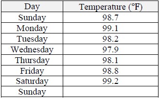
  • Part A. If he took his temperature on the Sunday of the next week and it was 103.2°F, which measures of center and variation could be used to summarize the data? Explain your choice.
  • Part B. How does the addition of the temperature 103.2°F impact the measures of center and variation?


*The strategies, tasks and items included in the B1G-M are examples and should not be considered comprehensive.

Related Courses

This benchmark is part of these courses.
1205010: M/J Grade 6 Mathematics (Specifically in versions: 2014 - 2015, 2015 - 2022, 2022 and beyond (current))
1205020: M/J Accelerated Mathematics Grade 6 (Specifically in versions: 2014 - 2015, 2015 - 2020, 2020 - 2022, 2022 and beyond (current))
1204000: M/J Foundational Skills in Mathematics 6-8 (Specifically in versions: 2014 - 2015, 2015 - 2022, 2022 and beyond (current))
7812015: Access M/J Grade 6 Mathematics (Specifically in versions: 2014 - 2015, 2015 - 2018, 2018 - 2022, 2022 and beyond (current))

Related Access Points

Alternate version of this benchmark for students with significant cognitive disabilities.
MA.6.DP.1.AP.6: Calculate and identify changes (increase or decrease) in the median, mode or range when a data value is added or subtracted from a data set.

Related Resources

Vetted resources educators can use to teach the concepts and skills in this benchmark.

Formative Assessment

Compare Measures of Center and Variability:

Students are asked to explain the difference between measures of center and measures of variability.

Type: Formative Assessment

Lesson Plans

A MEANingful Discussion about Central Tendency:

Using relatable scenarios, this lesson explores the mean and median of a data set and how an outlier affects each measure differently.

Type: Lesson Plan

Exercise Your Brain, Analyze Your Heart Rate:

Students will compile the data gathered from measuring their resting heart rates and heart rates after exercising into box plots. Using these displays, they will analyze the data's center, shape, and spread.

Type: Lesson Plan

Bowling for Box Plots:

Students will learn about the effects of an outlier and interpret differences in shape, center, and spread using a bowling activity to gather data. The students will learn to score their games, report their scores, and collectively measure trends and spread by collaborating to create a box plot. They will analyze and compare box plots, and determine how much of an effect an extreme score (outlier) can have on the overall box plot of the data.

Type: Lesson Plan

What's My Grade?:

"What's My Grade" is a lesson that will focus on a sample student's grades to demonstrate how a final grade is calculated as well as explore possible future grades. Students will create the distributions of each grade category using histograms. They will also analyze grades using mean and standard deviation. Students will use statistics to determine data distribution while comparing the center and spread of two or more different data sets.

Type: Lesson Plan

How tall is an 8th grader?:

Ever wonder about the differences in heights between students in grade 8? In this lesson, students will use data they collect to create and analyze multiple box plots using 5-number summaries. Students will make inferences about how height and another category may or may not be related.

Type: Lesson Plan

Plane Statistics:

This lesson starts with an activity to gather data using paper airplanes then progresses to using appropriate statistics to compare the center and spread of the data. Box plots are used in this application lesson of concepts and skills previously acquired.

Type: Lesson Plan

Which One: Box plot, Dot Plot, or Histogram?:

Students will be asked to obtain data and create a human box plot, which will be analyzed and explained using statistical terms. Students will then understand the differences and advantages to using the box plot, histogram, and dot plot. Students will also practice selecting the most appropriate graphical representation for a set of data.

Type: Lesson Plan

What's Your Tendency?:

This resource can be used to teach students how to create and compare box plots. After completing this lesson, students should be able to answer questions in both familiar and unfamiliar situations.

Type: Lesson Plan

Which is Better? Using Data to Make Choices:

Students use technology to analyze measures of center and variability in data. Data displays such as box plots, line plots, and histograms are used. The effects of outliers are taken into consideration when drawing conclusions. Students will cite evidence from the data to support their conclusions.

Type: Lesson Plan

Birthday Party Decisions:

Students will create and compare four different boxplots to determine the best location for a birthday party.

Type: Lesson Plan

Outliers in the Outfield – Dealing With Extreme Data Points:

Students will explore the effects outliers have on the mean and median values using the Major League Baseball (MLB) salary statistics. They will create and compare box plots and analyze measures of center and variability. They will also be given a set of three box plots and asked to identify and compare their measures of center and variablity.

Type: Lesson Plan

Marshmallow Madness:

This lesson allows students to have a hands-on experience collecting real-world data, creating graphical representations, and analyzing their data. Students will make predictions as to the outcome of the data and compare their predictions to the actual outcome. Students will create and analyze line plots, histograms, and box plots.

Type: Lesson Plan

Comparing Data Using Box Plots:

Students will use box plots to compare two or more sets of data. They will analyze data in context by comparing the box plots of two or more data sets.

Type: Lesson Plan

A Walk Down the Lane:

Students will collect data, and create box plots. Students will make predictions about which measurement best describes the spread and center of the data. Students will use this information to make predictions.

Type: Lesson Plan

Centers, Spreads, and Outliers:

The students will compare the effects of outliers on measures of center and spread within dot plots and box plots.

Type: Lesson Plan

Sweet Statistics - A Candy Journey:

Students will sort pieces of candy by color and then calculate statistical information such as mean, median, mode, interquartile range, and standard deviation. They will also create an Excel spreadsheet with the candy data to generate pie charts and column charts. Finally, they will compare experimental data to theoretical data and explain the differences between the two. This is intended to be an exercise for an Algebra 1 class. Students will need at least 2 class periods to sort their candy, make the statistical calculations, and create the charts in Excel.

Type: Lesson Plan

Interpreting Box Plots:

Students will analyze various real world scenario data sets and create, analyze, and interpret the components of the box plots. Students will use data from morning routines, track times, ages, etc. Lesson includes a PowerPoint, homework, and assessments.

Type: Lesson Plan

Is It a Guess or Statistics?:

This lesson teaches random sampling which leads to making inferences about a larger group or population. Students will determine the best measure of center to use for a data set. Students will collect data, select a data display and then analyze the data.

Type: Lesson Plan

A MEANingful Discussion about Central Tendency:

Using relatable scenarios, this lesson explores the mean and median of a data set and how an outlier affects each measure differently.

Type: Lesson Plan

Exploring Central Tendency:

Students will review measures of central tendency and practice selecting the best measure with real-world categorical data. This relatable scenario about ranking the characteristics considered when purchasing a pair of sneakers, is used to finally answer the age-old question of "When will I ever use this?".

Type: Lesson Plan

Original Student Tutorials

Math Models and Social Distancing:

Learn how math models can show why social distancing during a epidemic or pandemic is important in this interactive tutorial.

Type: Original Student Tutorial

It Can Be a Zoo of Data!:

Discover how to calculate and interpret the mean, median, mode and range of data sets from the zoo in this interactive tutorial.

Type: Original Student Tutorial

Perspectives Video: Teaching Ideas

Using Visual Models to Determine Mode, Median and Range:

Unlock an effective teaching strategy for teaching median, mode, and range in this Teacher Perspectives Video for educators.

Type: Perspectives Video: Teaching Idea

Rubber Band Races for Testing Measurement Accuracy:

<p>This activity will send your measurement lab to new distances.</p>

Type: Perspectives Video: Teaching Idea

Tutorial

Find a Missing Value Given the Mean:

This video shows how to find the value of a missing piece of data if you know the mean of the data set.

Type: Tutorial

MFAS Formative Assessments

Compare Measures of Center and Variability:

Students are asked to explain the difference between measures of center and measures of variability.

Original Student Tutorials Mathematics - Grades 6-8

Math Models and Social Distancing:

Learn how math models can show why social distancing during a epidemic or pandemic is important in this interactive tutorial.

Original Student Tutorials Mathematics - Grades 9-12

It Can Be a Zoo of Data!:

Discover how to calculate and interpret the mean, median, mode and range of data sets from the zoo in this interactive tutorial.

Student Resources

Vetted resources students can use to learn the concepts and skills in this benchmark.

Original Student Tutorials

Math Models and Social Distancing:

Learn how math models can show why social distancing during a epidemic or pandemic is important in this interactive tutorial.

Type: Original Student Tutorial

It Can Be a Zoo of Data!:

Discover how to calculate and interpret the mean, median, mode and range of data sets from the zoo in this interactive tutorial.

Type: Original Student Tutorial

Tutorial

Find a Missing Value Given the Mean:

This video shows how to find the value of a missing piece of data if you know the mean of the data set.

Type: Tutorial

Parent Resources

Vetted resources caregivers can use to help students learn the concepts and skills in this benchmark.