


Read and interpret data presented in various formats. Determine whether data is presented in appropriate format, and identify possible corrections. Formats to include:
- bar graphs
- line graphs
- stem and leaf plots
- circle graphs
- histograms
- box and whiskers plots
- scatter plots
- cumulative frequency (ogive) graphs
Remarks
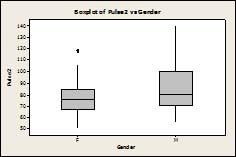
Example: The chart below shows the average daily high and low temperatures in an Australian city. What is the average high temperature in January? What is the average low temperature in March? Which month has higher temperatures, January or April? Can you think of a reason for this? Example: Compare the distributions of pulse rates for males and females by interpreting the following box and whisker plots: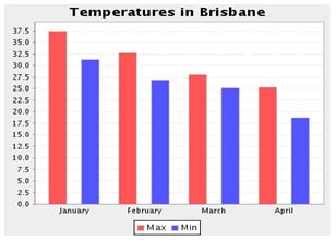
General Information
Subject Area: X-Mathematics (former standards - 2008)
Grade: 912
Body of Knowledge: Statistics
Idea: Level 2: Basic Application of Skills & Concepts
Standard: Summarizing Data (Descriptive Statistics) - Learn to work with summary measures of sets of data, including measures of the center, spread, and strength of relationship between variables. Learn to distinguish between different types of data and to select the appropriate visual form to present different types of data.
Date Adopted or Revised: 09/07
Content Complexity Rating:
Level 2: Basic Application of Skills & Concepts
-
More Information
Date of Last Rating: 06/07
Status: State Board Approved - Archived
Related Access Points
Alternate version of this benchmark for students with significant cognitive disabilities.
Related Resources
Vetted resources educators can use to teach the concepts and skills in this benchmark.
Lesson Plan
Virtual Manipulative
Student Resources
Vetted resources students can use to learn the concepts and skills in this benchmark.
Virtual Manipulative
Histogram Tool:
This virtual manipulative histogram tool can aid in analyzing the distribution of a dataset. It has 6 preset datasets and a function to add your own data for analysis.
Type: Virtual Manipulative
Parent Resources
Vetted resources caregivers can use to help students learn the concepts and skills in this benchmark.