
General Information
Test Item Specifications
MA.912.A.3.12 Graph a linear equation or inequality in two variables with and without graphing technology. Write an equation or inequality represented by a given graph.
Students will use linear equations to make predictions and/or find and use the rate of change (slope).
Graphs may be located in any of the quadrants.
Items may include linear equations in various forms, including standard, point-intercept, and point-slope forms.
In items assessing slope as a rate of change, the slope should be presented as a ratio.
Items may be set in either real-world or mathematical contexts.
Graphics should be used in most of these items, as appropriate.
Fill-in response items may require that students provide a slope, the x-coordinate of the x-intercept, the y-coordinate of the y-intercept, or the x-coordinate or y-coordinate of a point of interest.
Fill-in response items may have a negative answer.
Sample Test Items (2)
| Test Item # | Question | Difficulty | Type |
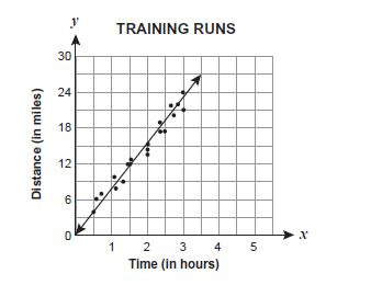
| Sample Item 1 | David is training for a marathon. He writes down the time and distance for each training run and then records the data on a scatter plot. He has drawn a line of best fit on the scatter plot, as shown below. Which statement best expresses the meaning of the slope as a rate of change for this line of best fit? |
N/A | MC: Multiple Choice |
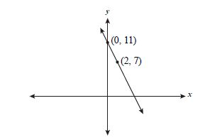
| Sample Item 2 | Joel graphed the line shown on the coordinate plane below. What is the x-coordinate of the point at which this line intersects the x-axis? |
N/A | FR: Fill-in Response |
Related Resources
Lesson Plan
| Name | Description |
| Spaghetti Bridges | Students use data collection from their spaghetti bridge activity to write linear equations, graph the data, and interpret the data. |
Problem-Solving Tasks
| Name | Description |
| Get a Half-life! | In this activity students are challenged to model a decay function by collecting data from a few trials, graphing the data, and then drawing a curve of best fit. The student must decide which of the equations best fits his/her data. |
| Drip, Drop, Drip, Drop | Students design an experiment to model a leaky faucet and determine the amount of water wasted due to the leak. Using the data they gather in a table, students graph and write an equation for a line of best fit. Students then use their derived equation to make predictions about the amount of water that would be wasted from one leak over a long period of time or the amount wasted by several leaks during a specific time period. |
Unit/Lesson Sequence
| Name | Description |
| Direct and Inverse Variation | "Lesson 1 of two lessons teaches students about direct variation by allowing them to explore a simulated oil spill using toilet paper tissues (to represent land) and drops of vegetable oil (to simulate a volume of oil). Lesson 2 teaches students about inverse variation by exploring the relationship between the heights of a fixed amount of water poured into cylindrical containers of different sizes as compared to the area of the containers' bases." from Insights into Algebra 1 - Annenberg Foundation. |
Video/Audio/Animations
| Name | Description |
| Fitting a Line to Data | Khan Academy tutorial video that demonstrates with real-world data the use of Excel spreadsheet to fit a line to data and make predictions using that line. |
| Soybean growth rate response to touch | A time-lapse video showing differential growth rates for touch-treated seedlings and control seedlings. This would be appropriate for lessons about plant growth responses to environmental stress and graphing growth rate. Plants were grown in a vermiculite soilless medium with calcium-enhanced water. No other minerals or nutrients were used. Plants were grown in a dark room with specially-filtered green light. The plants did not grow by cellular reproduction but only by expansion of existing cells in the hypocotyl region below the 'hook'. |
Student Resources
Video/Audio/Animation
| Name | Description |
| Fitting a Line to Data: | Khan Academy tutorial video that demonstrates with real-world data the use of Excel spreadsheet to fit a line to data and make predictions using that line. |
Parent Resources
Video/Audio/Animation
| Name | Description |
| Fitting a Line to Data: | Khan Academy tutorial video that demonstrates with real-world data the use of Excel spreadsheet to fit a line to data and make predictions using that line. |